Omega Shielding Products
A Brand Elevation for a Specialty Manufacturer
MISSING OPPORTUNITIES?
As Omega Shielding transitioned to its second generation of leadership, management recognized that the company was missing out on opportunities from lack of brand recognition. The company needed to stand out and engage the marketplace with impact, emotion and relevance.
BEING UNCOMMON
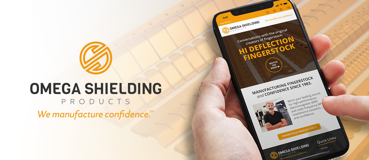
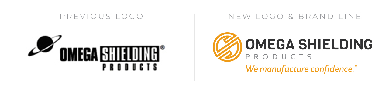
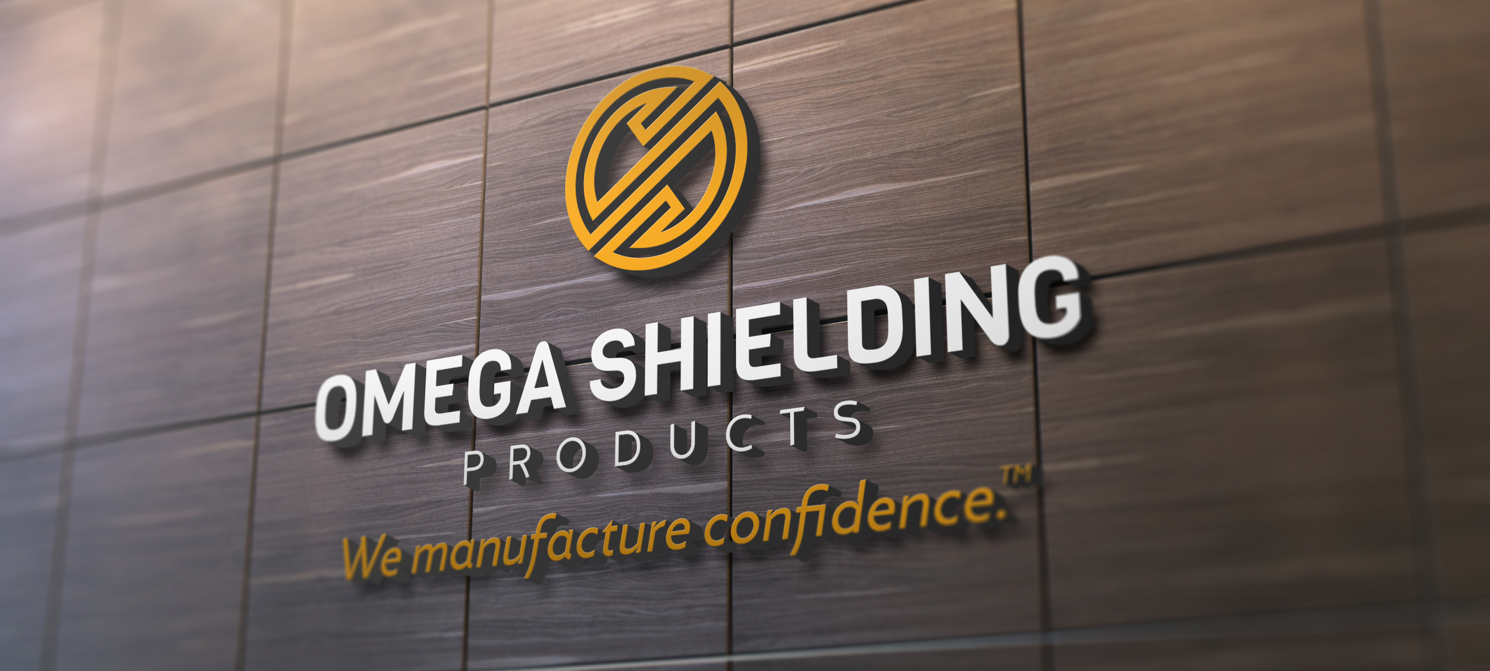
As Brand Discovery progressed, many opportunities to visually differentiate emerged through the creation of a new, dynamic logo mark and use of an industry-unique color scheme (that also happened to align with the copper color of the Omega Shielding product line). The new Omega Shielding symbol creatively combines the “O” and “S” while replicating the pattern the shielding products they produce.
A PROMISE BASED ON CONFIDENCE
From a messaging standpoint, the goal was to recognize and elevate the true reasons why customers place their trust in Omega Shielding. It’s not because they are the industry’s low-cost provider. On the contrary, they tend to command a higher price in the marketplace, and with good reason. When a customer’s shielding requirements are critical to the success of a product, Omega Shielding is the best possible solution. The message is less about the product, and all about the confidence a customer can have in knowing they are working with the highest quality supplier in the industry and can justifiably have an expectation of excellence from products, to service, to support and beyond.
SETTING THE STAGE OR GROWTH
The new brand foundation was developed in preparation for expansion as the company eyes strategic growth opportunities, both domestically and abroad.


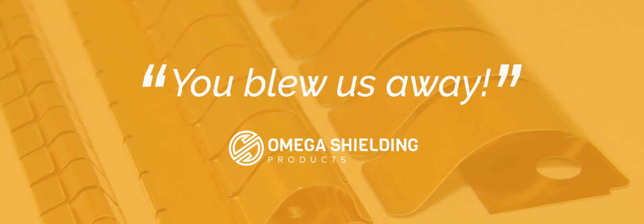
A HAPPY CLIENT