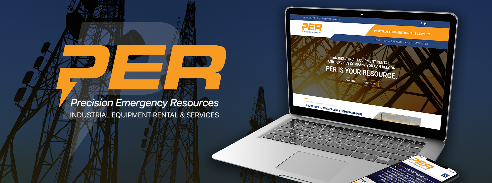
GIVING A FRESH FACE AND VOICE TO AN EMERGING INDUSTRIAL EQUIPMENT RENTAL AND SERVICES COMPANY
THE SITUATION
As a start-up, industrial equipment rental and services company, PER was a virtual unknown to its key customer audiences.
THE ASSESSMENT
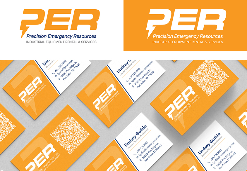
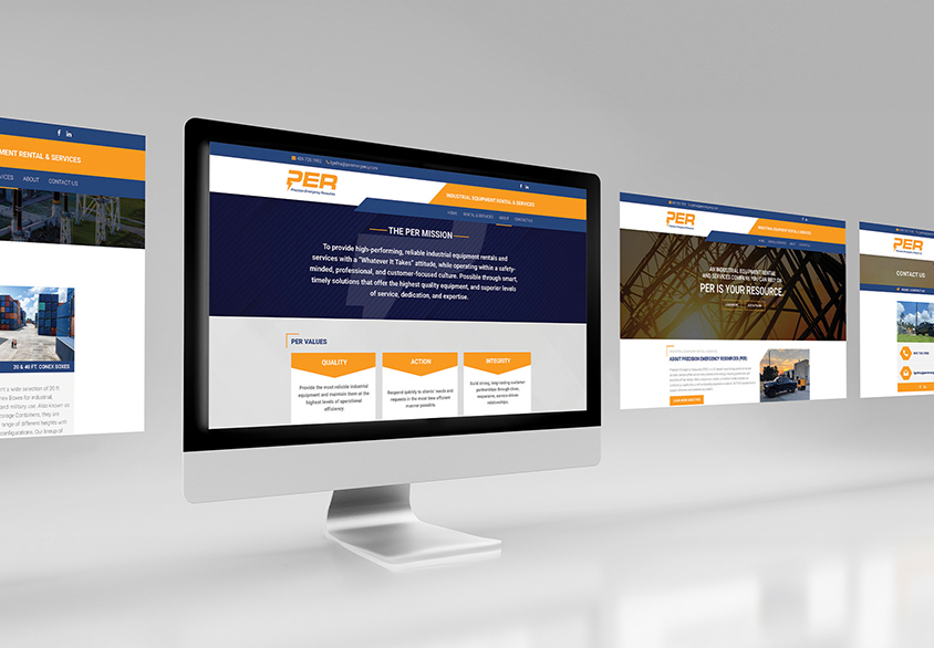
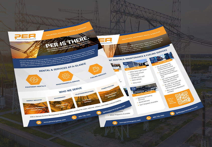
Awareness was job #1 for attracting leads and right-fit prospects. Included in the company’s objectives was a visual and messaging structure that would authentically represent the brand.
THE SOLUTION
A select group of Brand Leadership Solution® tools and capabilities were chosen and applied to solve PER’s targeted objectives, including:
With its new market presence, PER has made significant inroads with target audiences. The communications program is forecast to generate considerable interest and inquiries.