MEANING > IDENTITY or… DUNKIN’
By Rich Palatini, Director, Brand + Creative, Delia Associates
Why Dunkin’ Deleted Donuts and
What It Represents for b2b Brands
Don’t worry, Dunkin’ Donuts isn’t eliminating those calorie-filled circles of greasy goodness so many of us harbor secret feelings for and occasionally succumb to.
Just the word.
Donuts.
Seem strange for a company that, by their own estimates sold 2.9 billion donuts and Munchkins worldwide in 2017?
I know, right?!
Actually, when viewed from a go-forward, company growth point of view, it makes total sense.
“Our new branding is one of many things we are doing as part of our blueprint for growth to modernize the Dunkin’ experience for our customers,” Dunkin’ Brands CEO David Hoffman said in a news release.
Add to that, the fact that the brand offers more than 25,000 different ways to order coffee along with an ever-expanding drink and food menu and it’s easy to understand the move.
Simply put, the brand is reaching for its “next.”
Next stage of opportunities, expansion, market growth, product offerings.
And the next stage of meaning for its customers.
In many ways, the brand’s name change is overdue.
Want more proof?
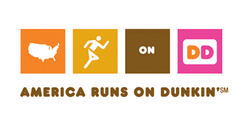
The company has been referring to the Brand itself as “Dunkin'” for almost a decade dating back to its first “America Runs on Dunkin'” campaign.
Here’s one more quite unexpected example.
In March 2018, Dunkin’ Donuts and Saucony introduce a limited-edition special Saucony X Dunkin’ Kinvara 9 running shoe, featuring a sprinkled donut and their tagline on each heel, cups of coffee pictured on the footbed liners, and the company’s logo on the tongue. Want to “run on Dunkin’? You can still get a pair on eBay.
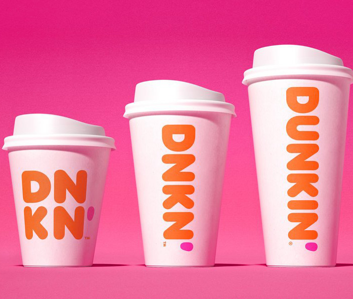
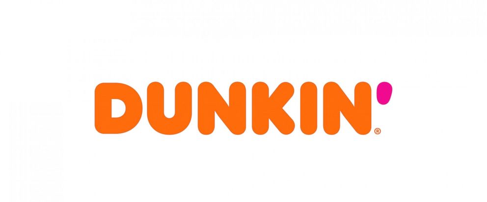
So, starting in January 2019, it’s just Dunkin’.
And that singular orange-color word followed by a bright pink apostrophe will bear the primary visual responsibility for representing the brand’s identification and meaning.
Other brands are also on-trend with this “simplification-for-growth” strategy, including Starbucks, which recently eliminated its brand name in favor of a mermaid-only (actually, it’s a siren) logo. Another is Weight Watchers, which is evolving into the initials “WW.”
In the case of the former, it’s to signify that they’re much more than coffee. In Weight Watchers’ case, they’re looking to expand the company beyond the bounds of its current perception as a diet-centric brand. In furthering this effort, it will also employ the WW logo as a reflection of their new tagline “Wellness that works.”
So, what’s the relevance of all this to your company?
The same fundamental principle applies to b2b brands and it reveals why customer experience is the core driver of your brand’s preference.
Here are three words that accurately sum it up (and yes, it’s a cliché): Simplify, simplify, simplify.
Do more for them and require less of them.
And make certain that your visual identity represents it. Everywhere. Everyday.
From logo to website to presentation tools, keep it concise, direct and customer-centric.
Here at Delia, we not only preach this principle, it’s baked into our DNA. And it’s yielded dramatic results.
Like a recent brand overhaul for FORTA Corporation, where we brought unified meaning to six diverse, affiliated companies through our Brand Leadership Solution® development process along with complete visual identity overhaul that aligned with their new positioning. You can see the full story here.
Earlier this September, we applied this same program and philosophy to the packaging machinery company Standard-Knapp, dramatically modernizing a 124-year-old industry stalwart, and restructuring its outstanding brand attributes to align with customer preferences. A new logo and visual identity renovation was a key component of the project.
You can see a lot more examples of our b2b simplification-for-growth solution at http://www.delianet.com/work/
And if you’d like to talk about it with us, we’ll bring the donuts and coffee.
Interested in learning more about this subject?
Please fill out the form and we’ll be in touch as soon as possible.